BLOGS
Modern Business Card Design Trends
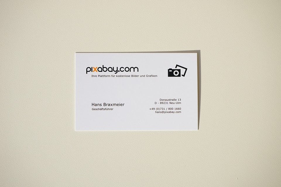
Having business cards is very important when it comes to making your business more accessible to people. It is not enough, though, that you have one. You have to make your business card pleasing to the eyes as chances are, your potential clients are receiving a dozen other business cards from other businesses, too.
Deciding on the business card design is actually not as easy as people may think. With tons of designs and templates available, it can be hard to choose which business card design will entice the most customers to give you a call. This article will list trends in modern business card design that you can choose from when making your own.
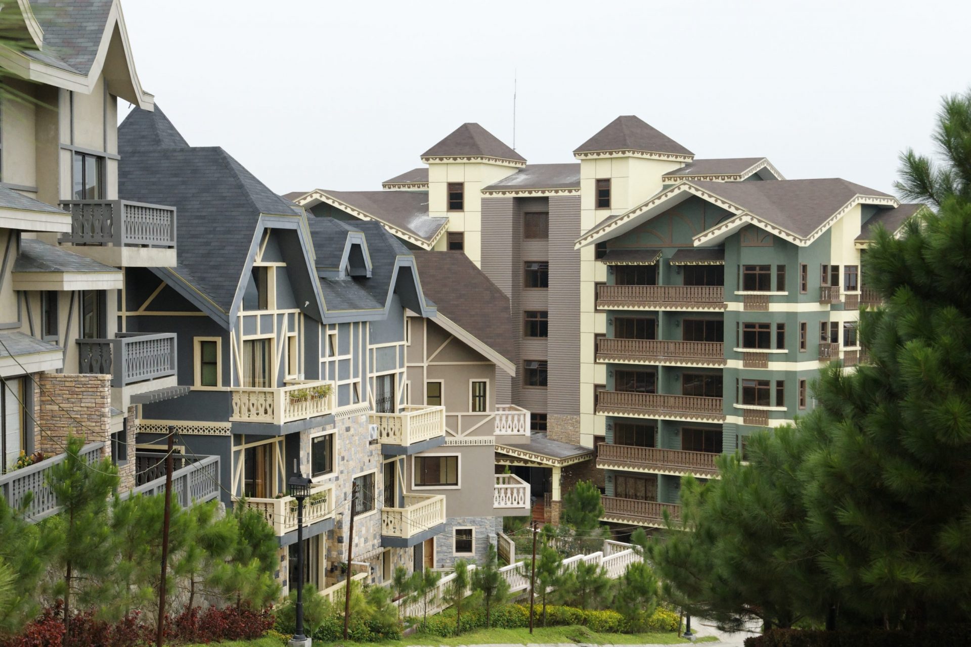
Whatever your job is — whether you are selling luxury real estate like Brittany homes or offering graphic design service — the following tips can help you promote your business and be remembered by your clients in the midst of competitors.
Modern Business Card Design Trends To Know
Plastic
One of the best things that happened to business card designs is the use of plastic instead of the usual cardstock. Using high quality plastic for your business card will make it look like a fancy credit card that your clients will put in one of the pockets of their wallet.
Using plastic will get the attention of your client, since most other business cards are made of cardstock. This will also make your card durable as it will be resistant to tears, folds, stains, and water. Your card will be readable for a long time and will be very hard to ignore.
It will also make your card look more serious and expensive, making it fit even for people selling the most beautiful houses in the Philippines from Brittany Corporation. A house and lot for sale is one of the biggest purchases that people can make, so better make a strong impression with your real estate business cards.
Aside from the durability, plastic also allows you to make a transparent or translucent card, making it sleek and unique, which brings up the second trend.

Sleek and Minimalist
Deviating from the old-fashioned business cards that were text-heavy and hard to read, modern business cards are sleek and minimalist. Minimalism is the new “in” now and it extends to luxury real estate, daily habits, and business cards.
Do not confuse your clients with overly fancy fonts and too much text. Rather, focus on just the important details and lay them out in such a way that it is easy to look at and read. Do not fill up all the space and strategically place the important things, like your contact details, for emphasis. Other details that can wait can just be placed on your company website that the client will check if your card is enticing enough. Some websites, like the one of Brittany Corporation, are already well-designed, so you just have to think of a way to get your clients to check it with your real estate business cards.
Contrasting Colors
Humans are highly visual and they place a lot of meanings on colors. It follows, then, that you should use them wisely. Your card does not have to be very colorful. You just have to use a few that blend well together.
Colors can manipulate your clients’ impression on your business. Using strong colors like black and gold can make your business appear to be a high end one. The use of pink can make your card look like a statement. At the end of the day, do not just choose colors that you like, but go with the ones that best represent your business.
Contrasting colors can also help some details stand out. You can use a darker hue, like midnight blue, as the background color, and then you can put the important details like your name and contact number in yellow textboxes. When choosing a color, also consider your company’s logo and the other images that you will put in the card.
Bold Fonts
Keep in mind that you do not have to be too formal when making your business card, so no need to stick with teacher-approved fonts. Feel free to use bold fonts that will make your card stand out.
When you’re designing you card, experiment with fonts and letterings that are out of the ordinary, and then try combining them so you would know which fonts go well together. Tall fonts can create an impression of wealth and elegance. Sans serif can make your card look cleaner and minimalistic. Go with fonts that are simple yet fashionable, and easy to read.
Logo
Logos are not a new thing, but what’s new is the way they are presented. Logos are very important and they should not just be placed in the corner like it’s just a requirement that has to be there. Beautiful logos should be emphasized more, so they will provoke thought and will easily be remembered.
A great way to do this is to make the logo bigger and noticeable. Some luxury real estate agents even think that the right place for your logo is the very center of the front of your business card. They would put nothing else in the front and then all the important details at the back. This is a guaranteed way to make your clients focus on the logo of your company.
Portrait
Your card may easily get lost in a stack of business cards, and one way to make sure it sticks out is to create a free business card with a vertical orientation. The modern business card is designed to catch the attention of clients, so you want your real estate business cards to be different from the others. That is how to separate your brand from others with a business card.
If you are going to sell the most beautiful houses in the Philippines, you need to make your business card design unique, so that it will easily be remembered. Make your card a standout, just like Brittany homes.

QR Code
The addition of a QR code on your business card is great, because it can lessen the amount of text you have to put. Everything you need to tell your clients can just be on the website that the QR code will direct your clients to. You just have to make sure that your client actually knows how to scan a QR code.
Your business cards can contain just the most basic details along with the QR code, and then all the other things like statements, your credentials, the house and lot for sale that you are selling can be on the website.
Personal Touch
Always, always add a personal touch to your business cards, so that they will be remembered. Do not be limited by the tips listed here, but you can go with a quote about the most beautiful houses in the Philippines, to let your clients know that you are serious about your job and that you reflected on it well enough to come up with an elegant statement. You can also put a professional portrait of you on the business card to make a strong impression.
Conclusion
Your business card is more than just a business card. Given the right design, it can help you make a powerful first impression on clients, and it can just be what pushes potential clients to be actual buyers.
Do you want to be a seller for Brittany Corporation? Go offer the most beautiful houses in the Philippines to your clients with a solid business card for a successful career in selling house and lot for sale. Check out Brittany’s E-Suite seller portal here.
Suggested Read: Pay For Your Southeast Asian Vacation By Scanning QR Codes
Suggested Read: How Does Grand Home Entrance Make A Statement
Suggested Read: Stylish Water Bottle Brands You Should Have
Suggested Read: Baguio Travel Requirements 2022

